Thursday 1 May 2014

Star Wars Figure Drawings


This set of images shows two models wearing a Stormtrooper costume and a Boba Fett costume respective. These were drawn in free time before the assignment, but as they are figure drawings I thought I would include them. The first one has a good sense of foreshortening on the left arm, but there is a slight proportional fault in that the head/helmet is slightly too big in comparison to the body.
 The second is a 5 minute drawing, and at the time I was new to figure drawing so there isn't as much detail than I would be able to achieve nowadays. That said it is in good proportion for what it is. 
The third and fourth drawings are of the same pose but from different vantage points. The third drawing is pretty well done, though the left leg is a little off. The fourth drawing also has slight error with the feet, though is the better of the two. There is a implied line down from the helmet down the right down and down the left leg.

Before this assignment I was but the Learner, and I am still yet to be the Master.


The Progression of One Minute Drawings


This set of one/two minute sketches of various gestures has been taken from various points in time over the semester, the drawing become more anatomically correct, showing that the further into the theory and practise of drawing anatomy I got, I became able to fit more information into a short time period.

Colour in Landscapes


In this landscape drawing of The Green the focus is the use of colour. As it was drawn during the evening with colour pastels, when house lights were turning on, it shows a more abstract tonal value between the vibrant colours of the shrubbery and the lights, in contrast to the the monochrome buildings. This use of a multitude of colours allows for an extremely impressionistic style to be used. There is a perspective error with the path, the edges should head towards a mutual vanishing point. There is however a good sense of depth despite this, due to the scale of the buildings in the backdrop. There is mixing of colours to various degrees and uses, the orange of the lamppost and the brown of the building midway through the drawing gives a impression of the light beginning to shine on the buildings wall.

Classical Interiors


This is a 30 minute landscape drawing of the interior of a church local to the artist. The piece is not completely finished due to time constraints. The piece has its upsides however, most notably in the way the perspective of the curves changes the further away they get from the vantage point. the curves around the top of the columns too adhere to this constant, and because they are higher than the vantage point they do not become straight. It is has good tonal contrast as the roof behind the arches are much darker than the rest of the piece. The white chandeliers oppose the dark roof but are not equal to it. making it unbalanced. The orthogonal lines of the piece do match up with each other onto a vanishing point, these are the the bottom of the dark roof, and the darker line behind the columns; this line also acts as the horizon line. The pews have faults in that they should be angles more acutely to the dark line behind the columns to give an impression of the height of the interior.

Shadows and Tonal Values


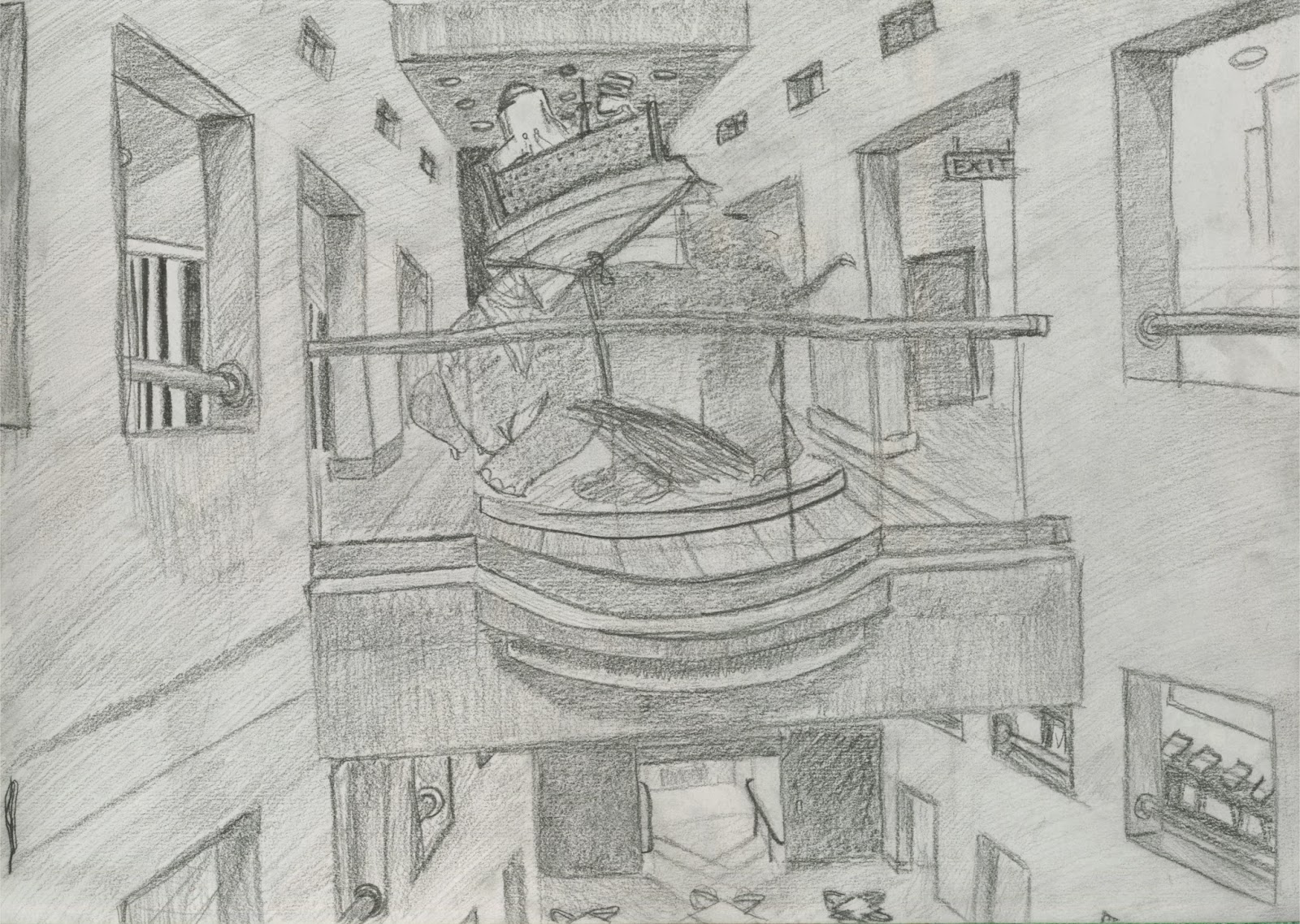
The focus of this drawing is shadows and tonal values, there was much time spent on this drawing hence the amount of detail put into it. The most obvious use of shadows, is at the bottom of the piece where the shadows of the railings cross one another. There are a large variety of tones in the drawing, and due to the centralised nature of the vantage point used to capture the image most of the dark tones are towards the middle. This creates a large contrast between the centre of the piece and the the outer rim of it. The  However, in terms of tone, the drawing adheres to the rule of thirds, as there are a few dark tones on either side of the central third. This drawing is perfect and has its faults mostly in that the orthogonal lines do not match up to one another due to a perspective error as the right side of the image is slightly bigger proportionally. Another error is that the small windows do not match up with the large windows at the top of the image. The elephant statue has slight impressionistic techniques to it, which help it stand out.

Perspective of Curves


This drawing was done in 20 minutes and is a study of the perspective of curves. The closer to the centre of the drawing the curves get, the more straight they get, vice versa the further away the curves get, the longer they get. The horizon line of the piece is midway through the windows along the bottom. The tops of buildings at either side of the curves should represent the vanishing points, though the one on the right has an error in that it does not correspond to its counterpart. There are errors with this piece, mostly with shading, the most prevalent of which is the curves of the atrium, the light would not not create shadows like those seen in the piece, and should instead show a gradual thinning from the right to the left. 


For the second drawing, black and brown conti crayons along with a graphite stick  have been used. From a different vantage point, the focal point is instead not the the curves themselves, but instead the tree in the foreground. Rather than be a highly detailed object, the tree, and in turn the piece its self becomes very impressionistic, as opposed to the other drawing. The mixed colours allows for a great contrast which allows the tree to stand out greatly and give the piece depth of field. The atrium which has the curves on it has become a backdrop, and the horizon line is represented by the bar at the bottom of the curves themselves. It could be said that there is an implied line down the curves of the right hand side of the atrium, and then down the trunk of the tree itself.

Non Human Anatomy


This set of sketches and drawings feature taxidermied animals, and a skeleton of an Elk. The Elk skeleton shows a quick rendition of a vantage point. It was done in around ten minutes, and as such is lacking in from few areas, the most obvious being that the perspective of the skeleton is slightly wrong, as it should be smaller towards the skull and front legs. The observation of the otter is done well, due to the foreshortening of the paws, and the detail of the graphite strokes form the fur texture.
The two bird sketches; a parrot and a bald eagle, were each done in 2 minutes, leaving little room for huge detail, but enough for the feathers. The superior in terms of balancing is the eagle as its mass is very centralised. However the parrot is a very good example of foreshortening and depth and was deliberately chosen for this reason.